Decades-old tradeshow flyer shows early plans for Punch-Out!!, Legend of Zelda box art
Cover to cover
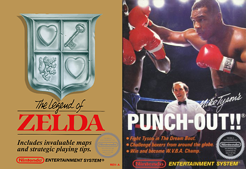
Above are the covers for The Legend of Zelda and Punch-Out!! on the NES. These are covers we’re all very familiar with, and of course, now we consider them to be iconic. That’s why it’s so interesting to learn Nintendo was almost going to go in a very different direction for both.
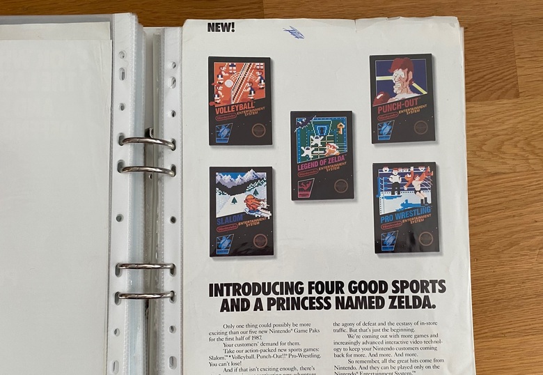
An old CES tradeshow flyer from Nintendo has been discovered, and it reveals that Nintendo originally had completely different designs in mind for the covers of Punch-Out!! and The Legend of Zelda. This was a retail-targeted flyer, which means retailers received this in the mail to prepare for upcoming products from Nintendo. The Big N knew these games were releasing in the near future, but clearly they hadn’t figured out the cover art yet!
For quite some time, Nintendo went with black box/in-game visuals approach for NES game box art. There are multiple NES games with boxes in this style, but Nintendo eventually broke away from that design choice to go with more unique covers for each game. We’re not sure why they made the change, but I think we can all agree it was for the better. It certainly makes a lot more sense for games like The Legend of Zelda!
Comments (1)