By the time a game sees release, it’s undergone hundreds, if not thousands of changes, tweaks, edits and more. More often than not, we don’t get to see these scrapped ideas, but in a rare move, Nintendo has shared a tiny bit of insight into what could have been for a recent Switch title.
Nintendo Switch Sports developer Toshiki Otani shared a blog talking about the challenges of creating a game made for people of all ages and familiarity with games. Absolutely everything is considered, from icons for characters, descriptions of how to hold the controller, and all sorts of things you would probably never think of. Of course, that amount of detail is also paid to the game’s packaging and logo as well.
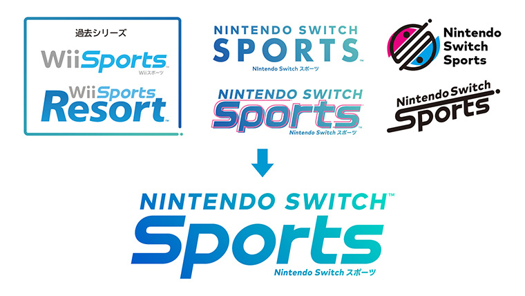
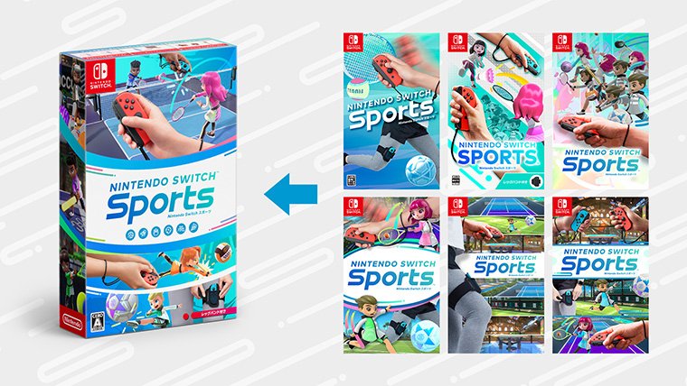
In this post, you can see a collection of logos Nintendo considered for Nintendo Switch Sports, along with a variety of packages they came up with. Some of the designs are quite close to what the final product ended up being, while others offer a completely different approach.
It’s obviously a somewhat impossible task to find what logos and cover art will woo the most consumers, and when you’re talking about a game with major expanded audience reach, these decisions are even harder. How do you feel about the final cover art and logo for Nintendo Switch Sports versus some of the other ideas Nintendo considered?
Add Comment
mikejones
1y agoI think they nailed the style and font for the title. And out of the options given for the cover art, I think I also prefer the final product. It emphasizes the three new sports with the three repeats on the side. I wouldn't have minded the bottom right, though. The dueling joy cons is a nice touch. The other cover art variants either look too busy or too barren.
Comments (1)