Mortal Kombat co-creator shares an early version of the game's logo
Dragon things out
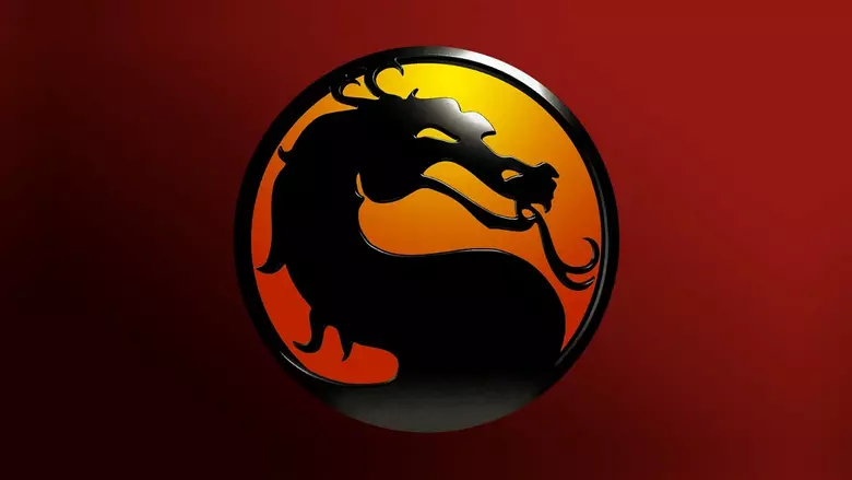
As far as game logos go, the one for Mortal Kombat is definitely one of the most iconic. It’s simple and straightforward, but it more than gets the job done. That’s why it’s remained the franchise’s logo for decades now, which is why it’s so surprising to learn we almost got something quite different!
Mortal Kombat co-creator John Tobias took to Twitter to share a doodle from way back in the day that shows off his original idea for the Mortal Kombat logo. You can see that design in the tweet below.
Rather than going with a close-up on the dragon’s face, the original Mortal Kombat logo almost went with the full body of the dragon, along with a bigger reference to the yin-yang design. There’s obviously nothing wrong with that original sketch, but I think most will agree that the logo on the right is the better of the two.
Comments (0)